
*this page is currently under construction
David E. Glover Center Rebranding
I developed the new visual identity for the David E. Glover Center.
Their new identity was applied to their website, social media channels, emails, flyers, postcards and business cards which positioned this non-profit as fun, accessible, credible and trustworthy.

Logo Redesign
The David E. Glover Center needed a new logo that was modern and fresh. Here are what the logos looked like before rebranding.
Here are some logo mockups where I experimented with type and placements.

The choice to keep the name of the center capitalized and the illustration of the cube was to help the students and partners still recognize the same center that they are used to, but now with a new look.
The cube was altered to support the initials of the center’s founder (David E. Glover).
A splash of purple was added to accommodate the center’s endless mission of providing free technology education to the East Oakland community, and I find that purple helped with making the illustration stand out more.
Here is the logo after rebranding:
Website Redesign

We launched our new rebranding on our social media campaign which was an effort to engage and connect with our community online.
Our new logo, Instagram story covers and better aligned content resulted in an increase of student enrollment and followers.


We accompanied our new logo with a new online interface that made information about the center easy for our audience to find. As a part of our rebranding, we illustrated people of color, of multiple ages, engaged in conversation and activity around technology. Check out the live website at www.degetc.org.

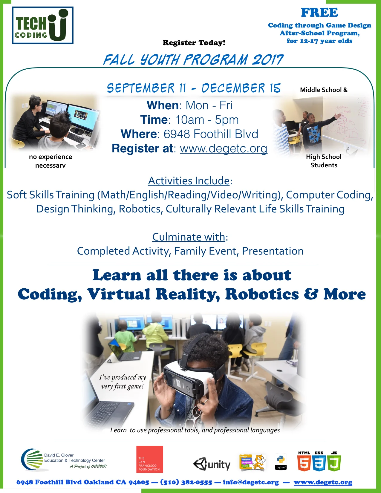
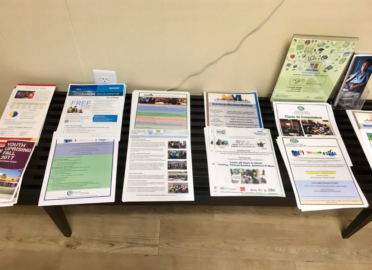
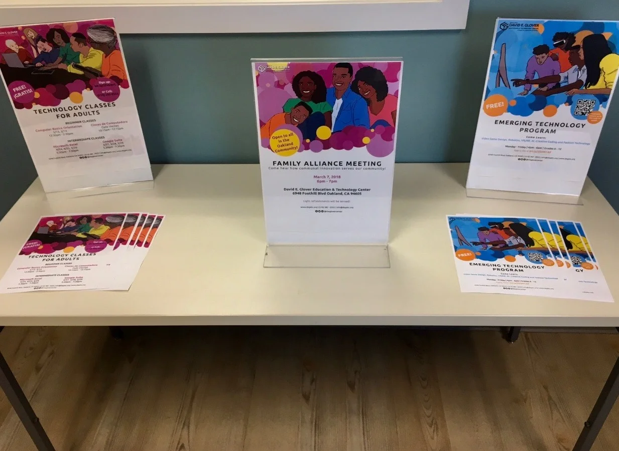
The next item on our list were flyers. The original flyers had a lot of information on them, so we decided to clean things up and limit the amount of information on the page. This gave me more space to include assets from our new brand design.


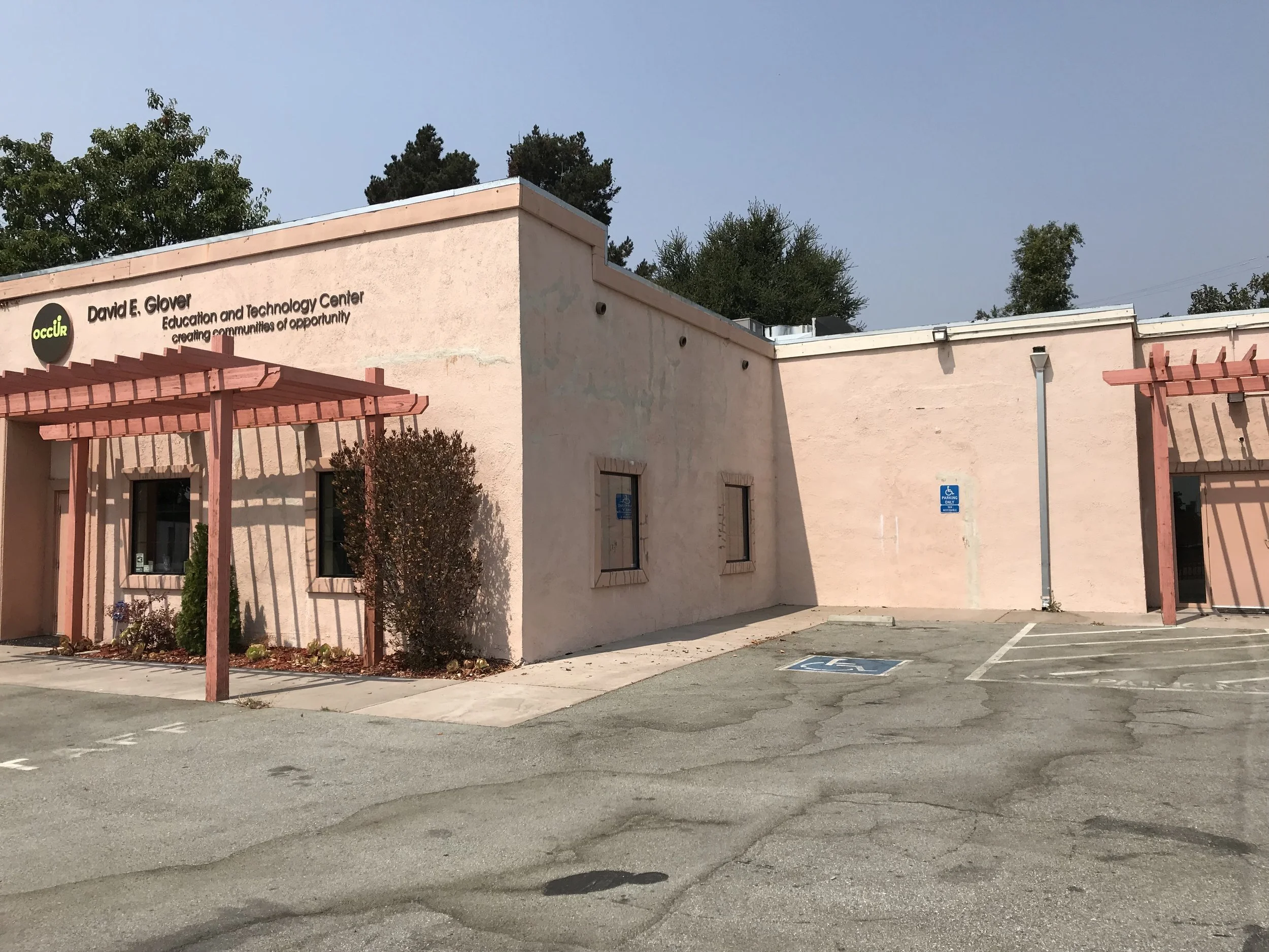
The last item on our list was the physical appearance of our building. Based on some feedback from our audience, our building gave off the impression of that we provided classes for the pre-school/elementary school populations. Our team needed to redesign its look so that it had a unisex color scheme, but was noticeable, and we wanted to convey that exciting things are happening here.
In our first designs, we played around with color. Our team researched color palettes that we could possibly work, and I used Adobe Photoshop to design different distributions of color along the building. Our goal here was to see what could work and what absolutely would not work. Below are some of our hits and misses. We were most inspired by Image D (labeled below), and we iterated on that design until we landed on something that best described the center — fun, exciting things happen here, come be apart of this!


Application
Based on the observations of our executive board, and some feedback from our audience, our team designed this version. Below is a before and after of the look.
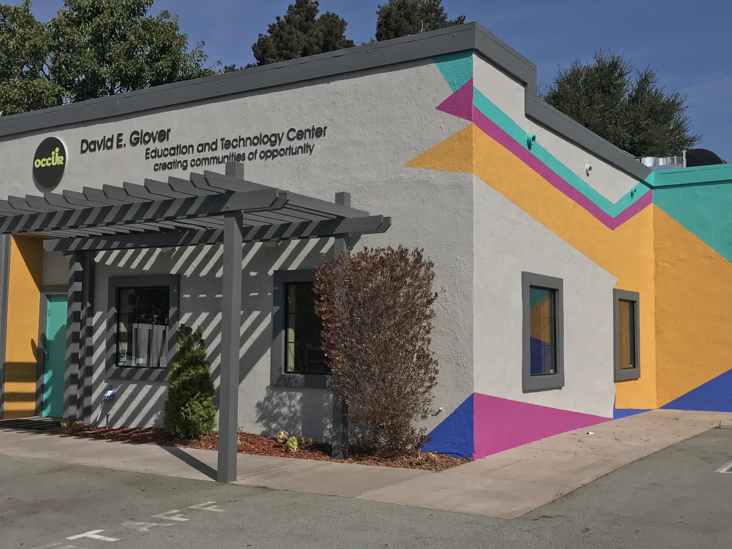
The final design is bold and bright so that it can stick out from the pastel colors of the surrounding buildings/structures, but also in a fun way so that it stands out to our students and serves as a social media moment for future events and collaborations. Here are a few snapshots of some social media moments with some of the folks from our audience.


Next, we applied our new branding across our social media accounts. New copy, our new logo, reference of colors from our logo and newly painted building, gave our rebranded account a colorful, exciting aesthetic.
TOOLS
HTML/CSS
Javascript & JQuery
Squarespace
Adobe Photoshop
Adobe Illustrator
Adobe After Effects
Adobe Premiere Pro
ROLE
Visual Design, Multimedia Design, Web Design and Illustration
COLLABORATORS
Olivia Cueva, Copywriter and UX
The Oakland Citizens Committee for Urban Renewal (OCCUR)
YEAR
2017-2018